The 10 second trailer surprisingly proved to be quite difficult because there is such a small time limit it left me using hardly any of the main narrative. However, I chose to use the drinking scene for my 10 seconds trailer because, as bad as it may sound, since my trailer is aimed at an audience aged between 15 - 18 I figured I would use the vibrant drinking montage to grab their attention and highlight something they may be interested in. The editing techniques used are same as that used in the main trailer, therefore there is reference to the full thing but this particular part of the narrative is a big moment that the fans will look forward to watching.
Friday, 22 March 2013
10 Second Trailer
The 10 second trailer surprisingly proved to be quite difficult because there is such a small time limit it left me using hardly any of the main narrative. However, I chose to use the drinking scene for my 10 seconds trailer because, as bad as it may sound, since my trailer is aimed at an audience aged between 15 - 18 I figured I would use the vibrant drinking montage to grab their attention and highlight something they may be interested in. The editing techniques used are same as that used in the main trailer, therefore there is reference to the full thing but this particular part of the narrative is a big moment that the fans will look forward to watching.
Monday, 18 March 2013
Final tweaked version, complete trailer!
The trailer is finally complete! Compared to last time I have altered the sound slightly although I don't think there is much of a difference and the final scene has been updated a little more. I gained inspiration to use a black and white effect on some of the clips from when I edited my 30 seconds trailer. This shows how what he is seeing is a flashback. Other effects such as 'ghosting' has been added to the drinking scenes and the final scene. This is to imitate the idea that the protagonist is under the influence and is able to move straight let alone think straight. The trailer has taken some time to get to this point and I believe with extra footage and more time dedicated to it I would have been able to create something more impressive, however I am still pleased with what I have done.
Friday, 15 March 2013
30 Second Film Trailer
Another part of our brief was to make not only a 1:30mins trailer but also a 30 seconds and a 10 seconds trailer. This is my 30 seconds and it uses a lot of the same features and sequence as the 1:30 mins trailer but it is a little more condensed. I am quite happy with how this has turned out because it quickly gets the main points of the film in, in the short space of time given.
Thursday, 7 March 2013
Film Poster Tweaked Version.
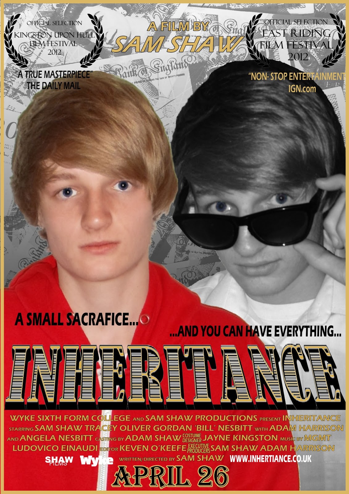
I decided to enlarge my images of my front cover and it seems to have made some improvement but not a lot. Yet again, a problem with the background, similar to that of the film magazine, is that it looks too sharp and it not making the main images stand out enough. Before I create a finished product this is an issue that needs addressing.
Monday, 4 March 2013
Film Magazine More Developed Draft!

The magazine is beginning to look more like a finished product. When asking for feedback I was made aware that the background is too sharp for the magazine and it is making it seem like that is the main image, this maybe a reason as to why the actual main image is not looking quite as smooth as it could.
The text and coverlines have improved, they are much easier to read now and are of a font that is not plain and boring and is one that can also be featured on my poster. The masthead has changed again however this time I am going to stick with it. The reason being is because although there is nothing much to it, it looks a lot more appealing than simple 'Arial' font in plain black. It also shows recognition from mastheads such as 'Empire' where there is nothing much to it but it's still effective.
Sunday, 3 March 2013
Film Poster Second Draft

Compared to the last attempt at a film poster, this one has altered quite a fair bit. The images before did not work very well, so I have used the new set of images to allow me to make a more refined poster. The post still feels empty as though there isn't enough there. The actor in the poster needs to be enlarged as well as the text needs to be easier to read. A lot of work is still required.
Subscribe to:
Posts (Atom)