Thursday, 27 December 2012

Codes and Conventions of a Film Magazine

The main objective of any media text is to make money. To do so they must create something that would attract their target audience and will them into buying the product. The conventions of a film magazine do just that through a variety of techniques. 

To begin with, their needs to be a title of the magazine which is more than usually, if not always, shown in the top left hand corner of the magazine. This is called the masthead and it is a key feature in any form of magazine, film, music, gaming etc. The examples of film magazines I have used are ‘Total Film’ and ‘Empire.’ A convention of the name of the magazines in that the masthead is never too long and is kept short. The reason being is because it needs to be short and snappy and easy to remember in order for the audience to be able to familiarise themselves with the product. For instance other examples would be ‘Play’, ‘Nuts’, ‘Zoo’ etc.  
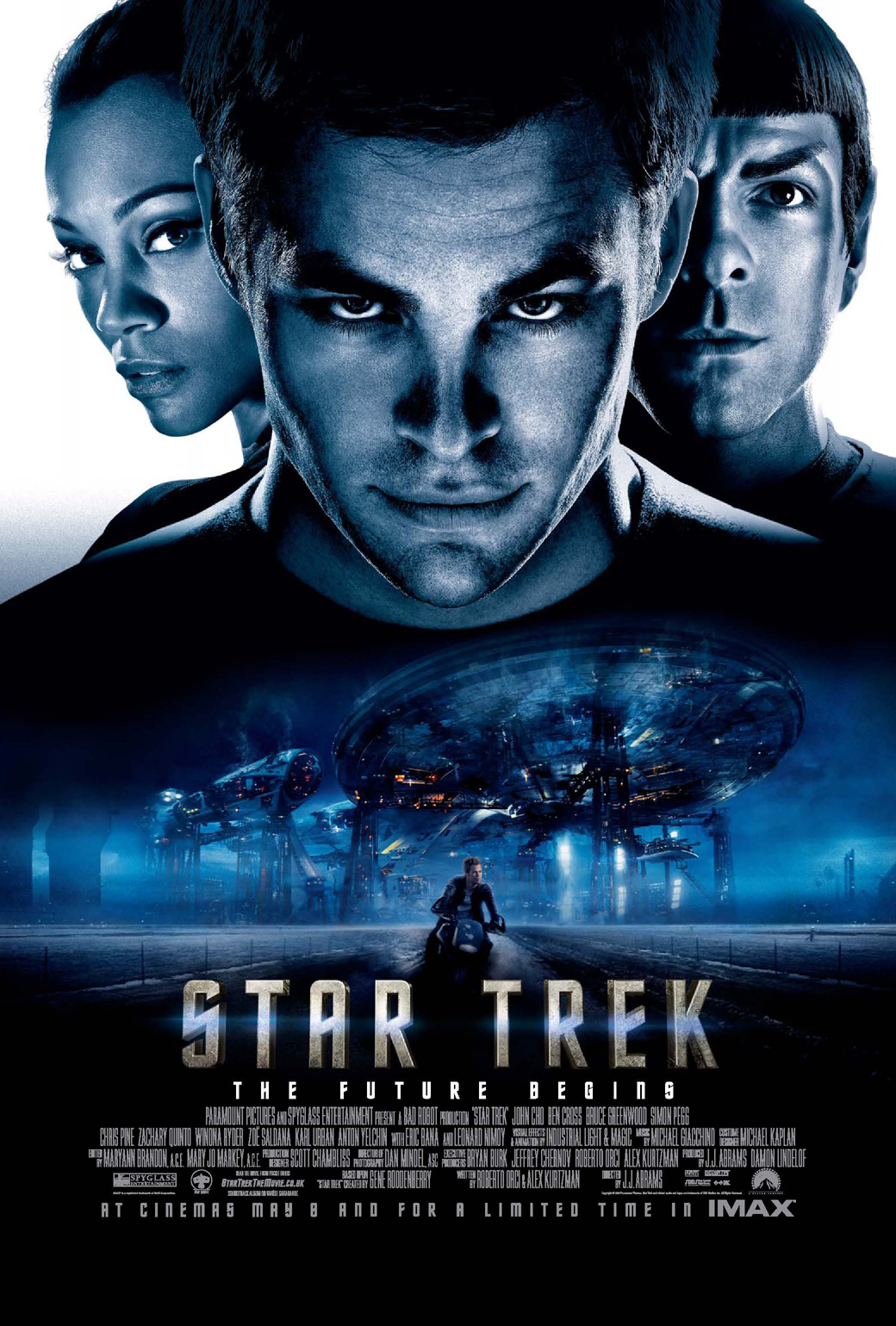
The next main convention is the main image. These images range from a medium shot to a close up and usually feature one character, the protagonist. The reason being is because they are acting as ‘the face’ of the film and when the target audience see the image they will instantly recognise who they are and then decide whether or not they are interested in reading further. A convention of these images is also they are the character they play as in the film with the costume and everything, this way the audience can see that the main topic that they will be discussing is the film they are recently starring in.

To go alongside this main image is the title of the film. This is the headline of the magazine, an example of these two conventions working together is the picture of ‘Martin Freeman’ and the title of the film ‘The Hobbit: An Unexpected Journey’ underneath the image. Together these work well in showing the main story of the magazine and help advertise it further. Another aspect of the headline is that the font of the text is usually typical of the film and this creates a theme. On the examples I am using, the font differs in the headlines from ‘Skyfall’ and ‘The Hobbit.’ This adds to the main story and makes the magazine more aesthetically pleasing. 


Since the headline is not the only story in the magazine, there are also cover lines that show many other parts of the magazine, although not the initial selling point of the magazine these help advertise it further and show many more reason for the audience to purchase the product. Usually, these cover lines surround the main image and are on the edge of the cover. The font is typical of the magazine but also conveys to the theme of the magazine, for example the ‘Empire’ magazine featuring ‘Inception’ shows the cover lines being warped and on an angle, this would not usually be like this but due to the headline and main story they are conforming to the theme of the magazine in order for it all to look appealing.


Although not seen on every front cover, another convention is several thumbnail images that coincide with the cover lines. These help sell the other stories and with images the audience can see further what will be featured inside. Images do help when it comes to advertising however it is not always necessary.

Other techniques used to advertise the product are skylines and teasing contents. These are few words that do not stand out but do show more information inside. The skyline is at the top of the page whereas the teasing contents are found at the bottom. This adds more detail to the front cover and shows that more and more is going on inside the magazine, allowing the audience to see they are getting their money’s worth. 

Sunday, 23 December 2012

Ancillary Texts 2


Another part of the brief was to create not only a film magazine front cover but also a film poster to go alongside the film trailer. Here are a select few of the many film posters, the conventions vary from showing one protagonist to a group of characters mostly medium shots and close ups. 

Ancillary Texts


Another part of my brief, other than creating a film trailer, is to produce a front cover to a film magazine featuring my film. Above are just a few existing front covers that I will use to help develop my own work. 

It is clear that a convention of the front cover is a medium close-up / close-up of the main character to highlight the top story within the magazine. Therefore I will need to find an image that is suitable to recreate this style and can also replicate the professionalism of existing magazines. 

Age Rating


Due to the content that will be in my full feature film I will be certifying it as aged 15. 


The BBFC state that, 15 works are stronger than 12 or 12A rated works and could include any of the following:

.) Strong Violence

.) Frequent strong language

.) Portrayals of sexual activity

.) Strong Verbal References to sex

.) Sexual Nudity

.) Brief scenes of sexual violence or verbal references to sexual violence

.) Discriminatory language or behavior

.) Drug taking

My trailer does not feature many of these and therefore can be viewed by 'Appropriate Audiences.'


This therefore means that I am able to reach a wider audience rather than creating a trailer for restricted audiences. 

Friday, 21 December 2012

Film Trailer, First Full Edit!


This is the first full edit of my film trailer were all the footage I have gathered that is relevant to my piece is put together. It is obvious a lot of work is still needed, such as text as well as re-shooting some shots, such as when the Mum is lecturing the protagonist, some of the shots look grainy and also being in the same outfit and location doesn't have the same effect as it would if I were to mix it up a little bit.

For a first draft it is not a bad start however there is still a lot that needs doing in order to make it look professional as well as trying to get the main story across. 

Thursday, 20 December 2012

Drinking Scene, First Edit


When my protagonist finally receives his money after his Grandad passes away, he enjoys it buying going to a local bar and drinking heavily.

What I have tried to accomplish in this edit is the shot changing quickly to go along with the rhythm of the music. I feel as though I have done this pretty well, all that is left it to put it with the rest of the narrative. 

Thursday, 13 December 2012

Film Trailer, more developed


This is my trailer so far. There is still some footage that I need to shoot, hence the black scene before the protagonist buys the lottery ticket. 
The beginning of the trailer is more appealing, I have faded the first voice-mail out so it doesn't end so abruptly. The soundtrack begins earlier in order for the main riff to start as the first establishing shot appears. I believe this works well as it opens up the following scenes more uniquely separating them from the first sequence. The vlog as seen previously is now added into my trailer. There are clear jump cuts within the vlog in order to get the main information across. As for the scene when the Mum is lecturing the protagonist, although I do like the editing within the sequence the shots become grainy when zooming into the Mum's face. This needs to be reshot and when I do so I will make the characters change outfits in order for it to create the illusion of this happening on a daily basis. 

Other than all of that, I am happy so far with my production piece.